A 404 page is one of the simplest ways to see how a brand handles mistakes.
Every online store has a few broken links hiding somewhere – maybe a product was discontinued, a category changed without a redirect, or a URL was mistyped. When that happens, the 404 page quietly steps in.
A 404 page is a web page that appears when the server can’t find what the user requested. Instead of showing an error code or blank screen, it gives websites a chance to guide visitors back to working pages – ideally, in a way that feels consistent with the brand.
It’s a small moment, but it says a lot about a brand. Some stores treat it like a dead end; others use it as a chance to reassure, redirect, or even delight the visitor.
Before we look at examples, let’s take a quick look at why this small page actually matters.
Table of Contents
Why 404 pages are important
404 pages are often underestimated, but they play a real role in both user experience and SEO.
- 404 pages keep users on your site. Instead of leaving frustrated, a well-designed 404 can guide visitors back to something useful – a category, product, or helpful article.
- 404 pages protect your brand image. A thoughtful design and friendly tone can turn a “broken” moment into a chance to show personality and care.
- 404 pages support SEO health. A functional 404 page helps search engines understand which pages are truly gone, while good internal navigation keeps crawl paths intact. For pages that used to bring traffic or links, it’s worth doing proper URL mapping to make sure they redirect to the most relevant new destination.
- 404 pages can even drive conversions. Promoting a discount, new collection, or popular product here gives users a reason to stay and engage.
Here’s how different retailers handle that moment – from the plain “nothing to see here” pages to those that turn an error into part of the brand experience.
1. Staples 404 page: No personality, no direction
The Staples 404 page looks like a raw server message – no design, no links, and no explanation. It feels like the site broke rather than simply missing a page. For a large retailer, it’s a missed opportunity: visitors can’t search or browse. Every visit to this 404 page likely ends in an exit.
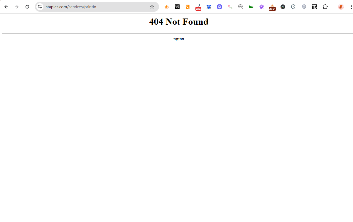
Takeaway: A 404 page should always include navigation and clear next steps. Otherwise, it quietly drains potential conversions.
2. Target 404 page: Technically fine, but not helpful
Target’s 404 page loads within the brand’s framework, but that’s where it stops. There’s no search bar, category links, or direction to keep the visitor engaged. The only way to the homepage is by clicking the logo – something many visitors won’t immediately notice. “Page unavailable” feels more like a technical report than customer communication.
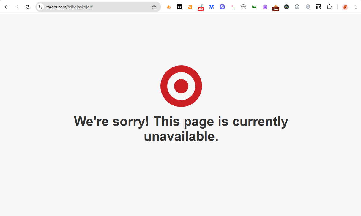
Takeaway: A 404 page shouldn’t rely on hidden cues like a logo link. Visible buttons or CTAs help users recover faster and reduce bounce.
3. Chewy 404 page: Warm and kind, but only one path
Chewy’s 404 page radiates empathy: real pets, real people, and friendly copy (“The Chewy pack is on the case!”). It feels human and trustworthy, which helps maintain customer goodwill. However, with only a single “Back to Home” button, the journey stops short – users have to do the work to find products again.
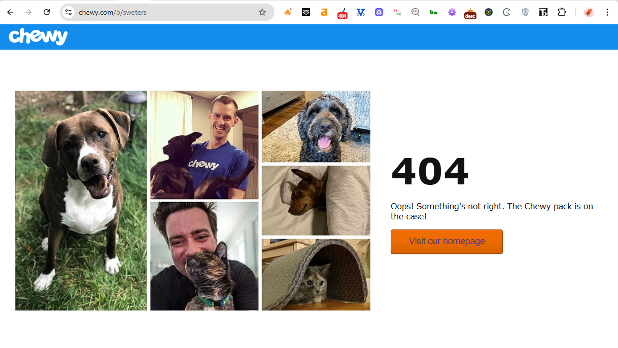
Takeaway: Tone builds trust, but UX drives conversions. Adding category and product suggestions or a search bar to a 404 page could turn this warmth into action.
4. Walmart 404 page: Simple and good-natured
Walmart’s 404 page uses a nostalgic “static TV” image and casual tone to keep things friendly. It’s clean, familiar, and unmistakably on-brand. The page includes a top navigation bar and a search option, so users can still browse — but it underuses the potential of a 404 page.
There are no product highlights, featured deals, or seasonal promotions that could turn a small hiccup into a sales moment.
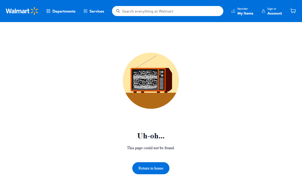
Takeaway: When a brand has such a wide product range, every 404 visit is an opportunity to recommend something new.
5. Victoria’s Secret 404 page: Basic, yet functional
This 404 page keeps things visually consistent with the brand: minimal design, strong typography, and soft tones. It includes a top navigation bar and a search option, allowing visitors to explore further without frustration. There’s no creative copy or visuals, but functionally it does what matters – keeps users in the store flow.
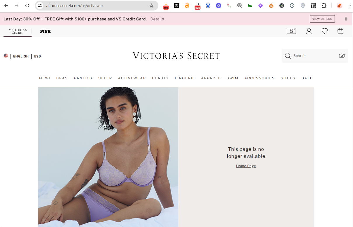
Takeaway: For large retail sites, simple usability often converts better than flair. Clear navigation and search are the foundation of an effective 404 page.
6. Wayfair 404 page: Clever and consistent
Wayfair’s 404 page gets the tone just right. The line “Seems like we’ve rearranged some furniture” is witty, on-brand, and instantly recognizable. However, beyond that clever copy, the page doesn’t offer any direct navigation or product suggestions.
The existing top navbar helps users recover – but that’s doing the heavy lifting. For a large eCommerce platform, it’s a missed opportunity to highlight trending categories and products.
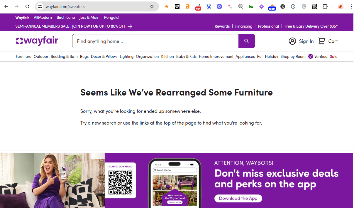
Takeaway: Humor draws attention, but navigation and merchandising close the sale. A few featured items or category links could make this playful 404 page truly functional.
7. Eight Sleep 404 page: Minimal and purposeful
As a single-product brand, Eight Sleep doesn’t need much complexity. The 404 page uses the top navigation and homepage link effectively to guide users, and cleverly features a current promotion. It’s clean, focused, and turns potential exits into engagement opportunities.
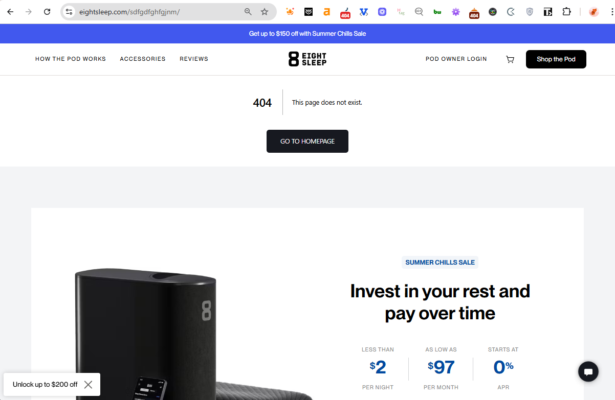
Takeaway: For focused brands, a simple 404 page can still drive action – highlighting offers or demos is a great way to re-engage lost visitors.
8. Aldi 404 page: Simple and practical
Aldi’s 404 page has a clear message and helpful links to main sections, so visitors can get back to shopping quickly. However, the layout order could be improved: the error message appears first, then a newsletter signup, and only after that come navigation links. Moving the links higher would make the experience smoother and more conversion-friendly.
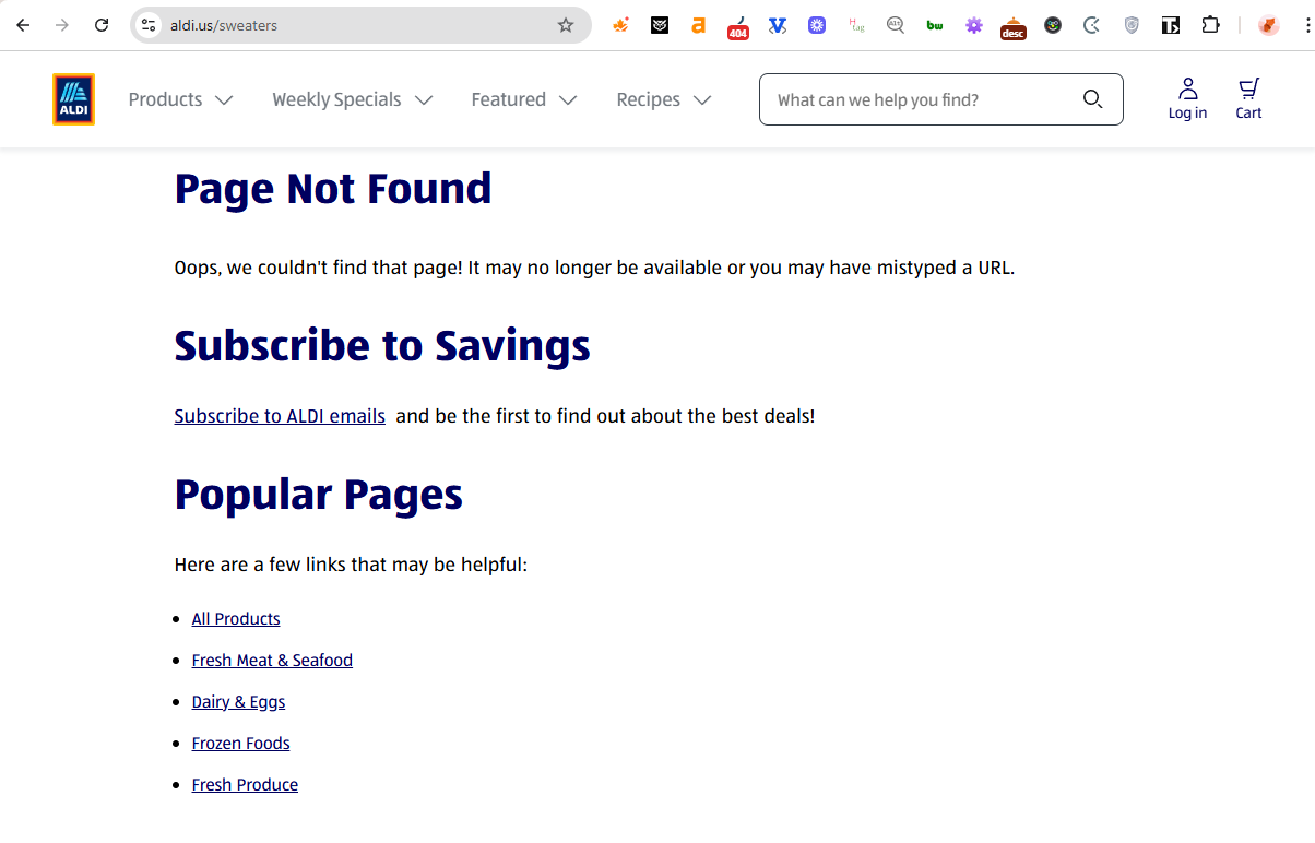
Takeaway: Order matters. Keep the most actionable elements – navigation or search – visible first, before any secondary CTAs.
9. Chick-fil-A 404 page: Playful and on-brand
The “404 – Gone Grazin’” message ties neatly into the brand’s personality and sense of humor, while the bright red background and cow graphic make it instantly recognizable. Users can reach categories from the top navigation links, and a search bar under the 404 page message lets visitors easily find what they need. It’s a fun, lighthearted take on an error page that still manages to be practical.
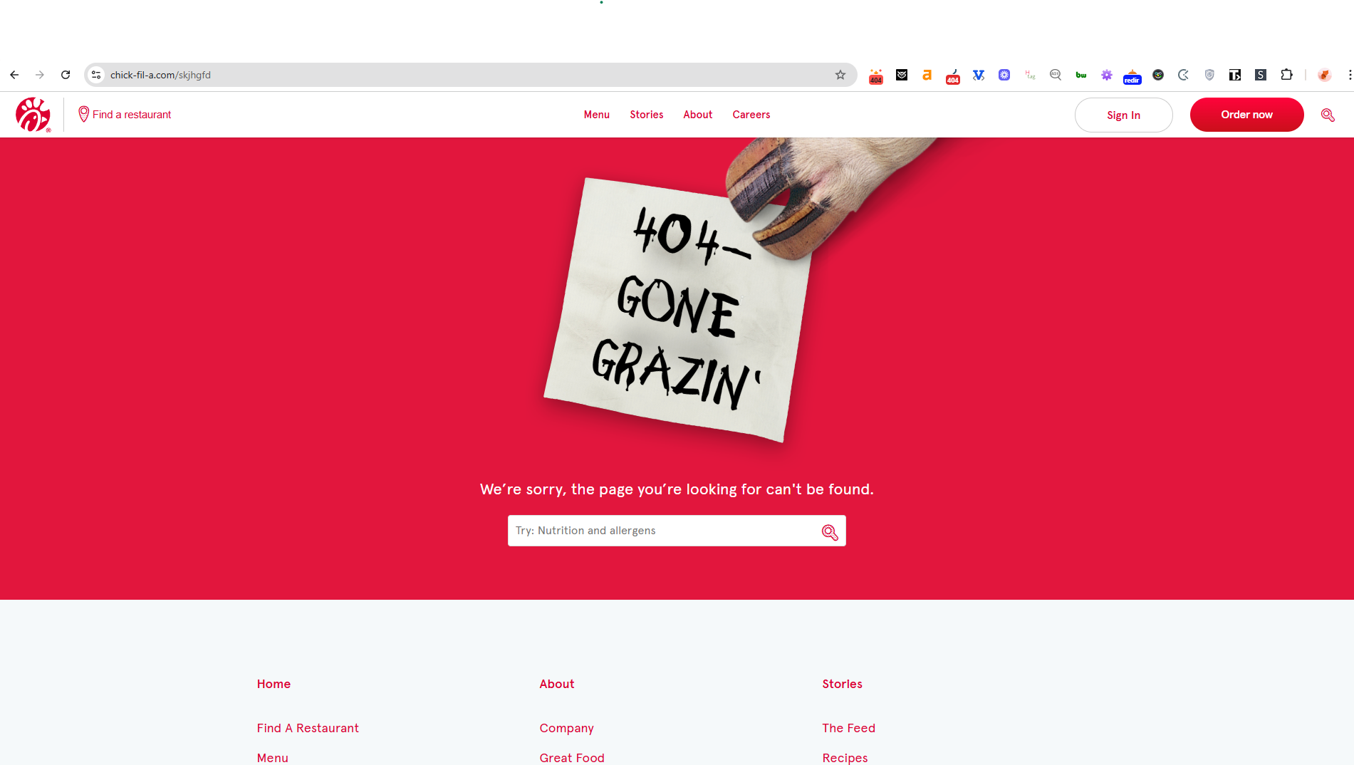
Takeaway: Brand familiarity builds comfort. This 404 page reassures visitors they’re still in the right place and guides them naturally back to ordering or exploring.
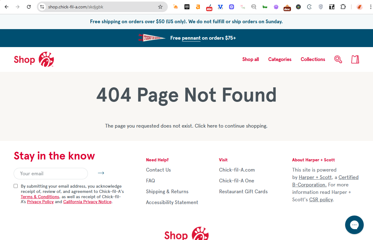
However, the Chick-fil-A shop’s 404 page feels more like a placeholder than part of the Chick-fil-A brand. It’s clean and structured, but lacks the warmth and personality the main site is known for. While it includes footer links and a newsletter sign-up, there’s no visual or tone connection to the restaurant experience. It does the job, but it feels like a separate entity – which, technically, it is.
10. Applebee’s 404 page: Friendly and practical
Applebee’s 404 page matches the rest of the site: approachable, visually cohesive, and direct. The “Start an Order” CTA is prominent – exactly what a hungry user needs. It might not be flashy, but it does what matters most: gets people back into the purchase funnel fast.
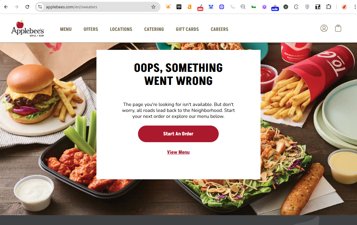
Takeaway: For service-oriented eCommerce, a clear primary CTA often outperforms creative copy.
11. Ralph Lauren 404 page: Elegant and brand-aligned
The Ralph Lauren 404 page is minimalist and refined, reflecting the brand’s aesthetic perfectly. It offers search and category links in a layout that feels deliberate and premium. The design works well as-is, but it could go a step further by highlighting seasonal categories or trending products to gently guide users into shopping.
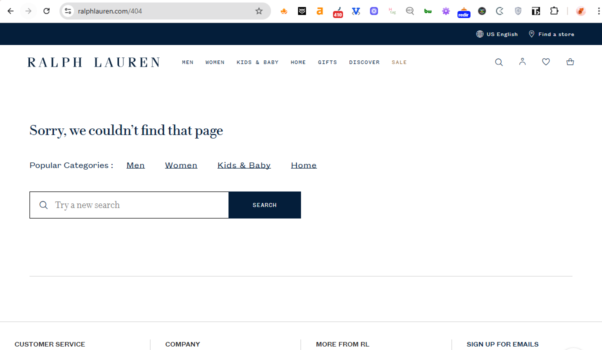
Takeaway: Even high-end brands can use subtle merchandising on their 404 page – it keeps the experience premium while supporting conversions.
12. Spend With Pennies 404 page: Functional, just not cozy
This 404 page offers a search bar and newsletter signup, so it’s practical. But the default “Nothing Found” heading feels generic. A bit more personality would match the site’s usual warmth. It could also use this space to promote popular or seasonal recipes – something that would feel more inviting and keep visitors exploring.
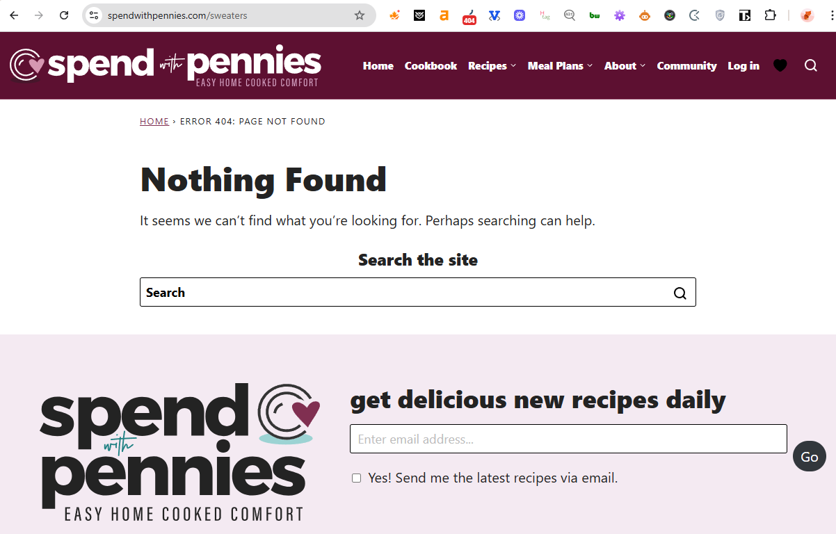
Takeaway: Utility is great, but personality builds retention. Add content that feels human to keep users engaged.
13. Kayak 404 page: Great idea, weaker follow-through
Kayak’s 404 page features a clever airport-style flipboard animation changing from “404” to a sad face — perfectly aligned with its travel brand. The page does include side links to travel-related sections, so users can still navigate easily. Still, the main 404 message itself feels a bit empty – it doesn’t suggest searches, destinations, or anything specific.
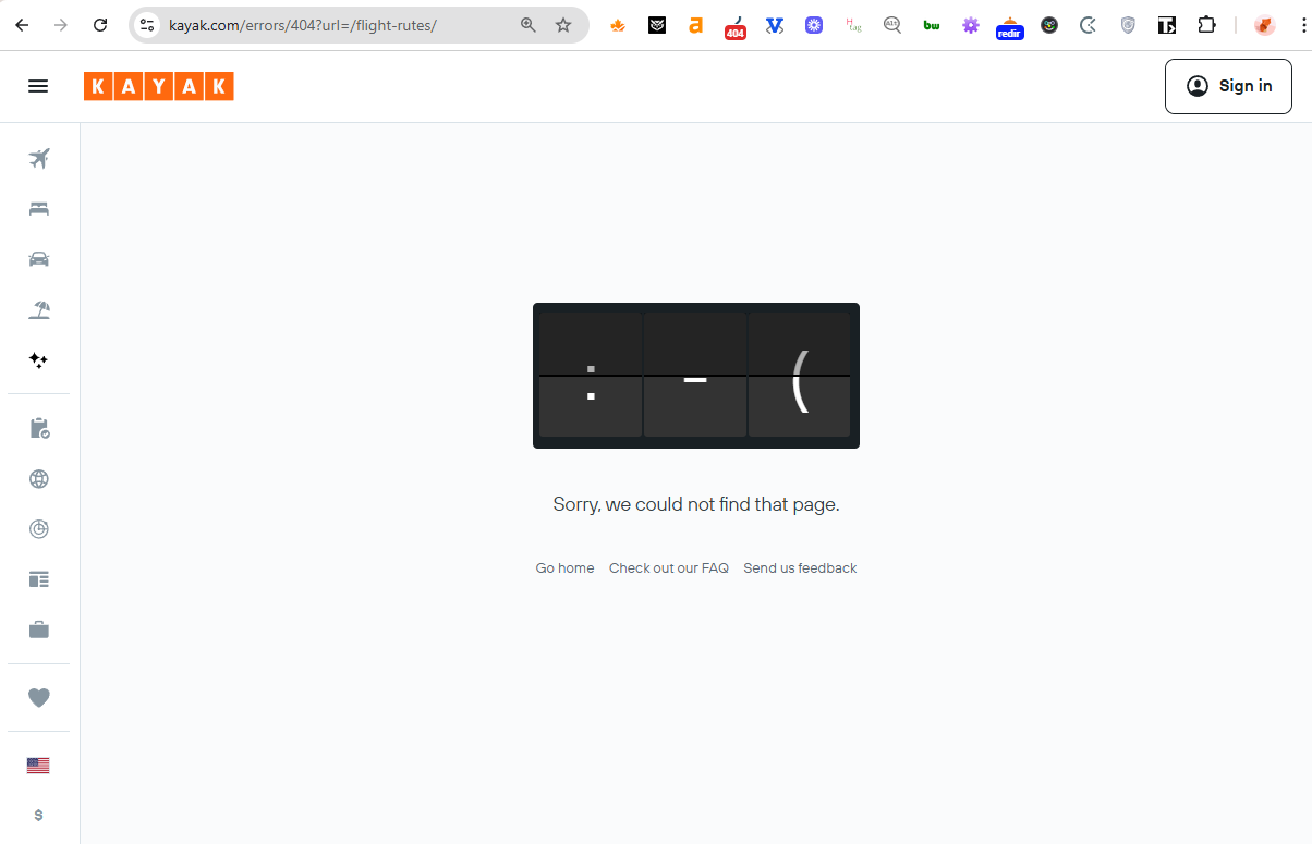
Takeaway: A 404 page can keep users dreaming of their next trip – but only if it points them to where they can start planning it.
14. Petco 404 page: Friendly and helpful
Petco’s 404 page hits a nice balance of charm and usability. A cute illustration, clear copy, and links by pet type make it simple for visitors to keep shopping. It feels true to the brand’s approachable tone while maintaining practical navigation.
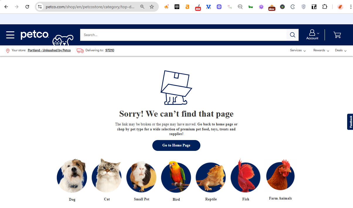
Takeaway: A 404 page that keeps users in familiar territory – like their pet’s category – can reduce bounce rates and encourage quick recovery.
15. Crumbl Cookies 404 page: Sweet and cheerful
Crumbl’s 404 page is short, colorful, and playful, with a bright “Oh no!” headline that matches the brand’s personality. It’s simple but recognizable, and the return-to-home button is easy to spot.
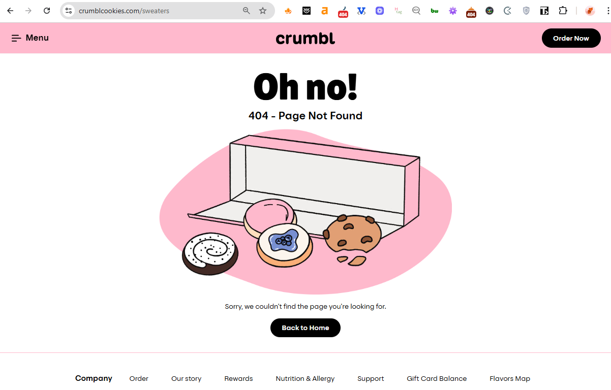
Takeaway: Sometimes a 404 page doesn’t need many elements – just clarity, brand tone, and a clear path back to the product.
16. Chili’s 404 page: Playful and memorable
The main Chili’s 404 page features retro cartoon peppers “fixing” the logo — instantly recognizable and completely in tune with the brand’s humor. The copy “Page under repair. Kind of.” adds personality.
The only drawback is that the image is oversized, so part of it sits below the fold. Showing the full composition would make the experience even more polished.
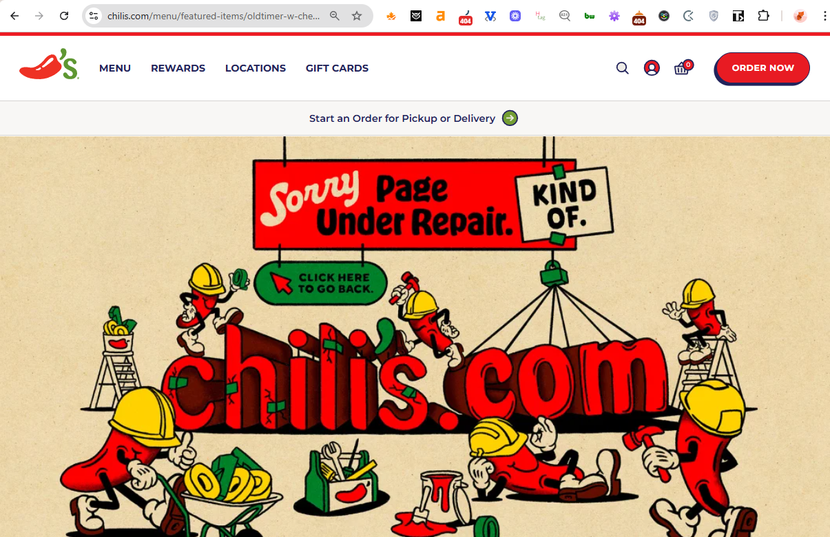
Takeaway: Visual storytelling can make a 404 page memorable – just ensure layout and visibility don’t hide the creativity.
The merch store’s 404 page uses the right brand colors and layout, but it feels too safe. A playful headline or photos of fans wearing the merch would capture the fun energy that defines Chili’s.
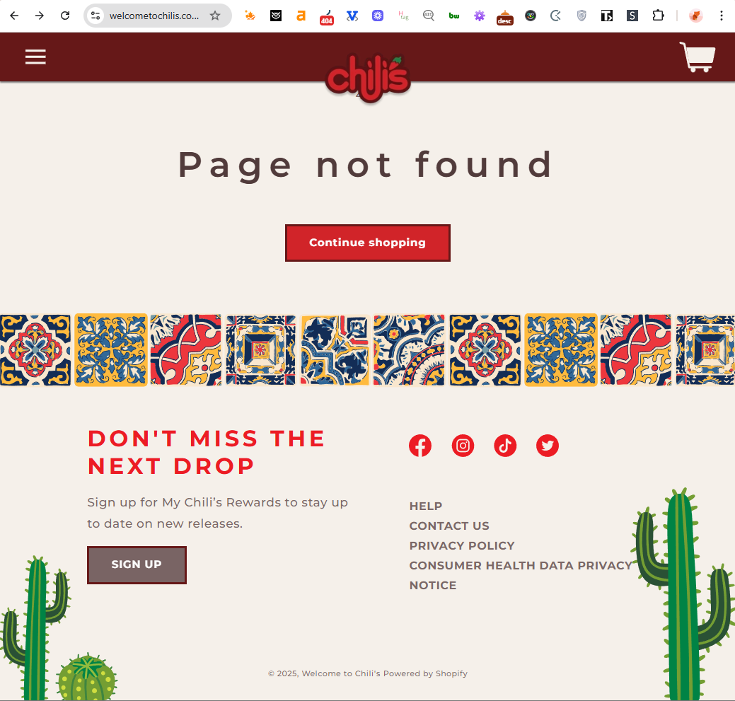
Takeaway: Merch stores can use 404 pages to showcase community and lifestyle – not just technical accuracy.
404 page best practices for eCommerce
A 404 page doesn’t have to be complex or flashy – but it should always help store visitors recover easily and keep them engaged. Every visit is still a potential conversion if the experience is handled well.
Below are some key best practices drawn from real eCommerce examples.
Have a styled and structured 404 page
A plain error message feels like the site is broken. Instead, your 404 page should look like a natural part of the website. Keep your main navigation, footer, and brand visuals intact so users immediately know where they are and can continue exploring.
A well-structured 404 page signals professionalism, maintains trust, and prevents drop-offs caused by confusion.
Add a search bar and helpful links
Make recovery easy. Include a search field and links to your most popular or strategic pages – such as bestsellers, new arrivals, or key categories.
If your site has a blog, link to high-performing or seasonal posts to keep users engaged longer. These small touches can turn a lost visit into meaningful browsing time.
Use your 404 page to feature promotions
Treat your 404 page like extra storefront space. You already have a visitor’s attention – use it.
Highlight ongoing sales, new product launches, or limited-time offers. Just like Eight Sleep’s example, featuring a promotion here can turn a “dead end” into a conversion opportunity.
Keep seasonal content and links fresh
If you showcase promotions or campaigns on your 404 page, make sure they’re updated or removed when they expire. An outdated banner undermines trust and makes the page feel forgotten.
Regular updates keep your 404 page aligned with current marketing efforts and prevent users from clicking on expired offers.
Stay on-brand with tone and visuals
Your 404 page is still part of the customer journey. Use your brand voice – whether that’s playful, elegant, or minimalist – to make the experience feel intentional.
Clever copy, consistent colors, and relatable imagery can reassure users they’re still in familiar territory. It’s also a subtle way to reinforce brand memory, even during a misstep.
Track and analyze 404 traffic
Use tools like Google Analytics 4 or Microsoft Clarity to monitor how often users reach your 404 pages and what they do next.
This data helps you understand whether visitors are finding their way back to the site – or dropping off entirely. It’s also an early signal for broken internal links or discontinued products that still attract clicks.
Fix broken links and plan redirects
Prevent unnecessary 404 visits by checking internal links regularly. For pages that previously ranked or brought in traffic, set up 301 redirects to relevant replacements.
If you’re going through a redesign or migration, plan ahead with a URL mapping
strategy to make sure valuable pages retain their SEO equity and users don’t get lost along the way.
Return the correct 404 status code
This one’s technical but essential. It’s not enough to just show a “Page not found” message – the server must return an actual 404 HTTP status.
That code tells search engines the page truly doesn’t exist, preventing it from being indexed or causing crawl issues. A properly configured 404 page protects your SEO health while keeping visitors informed.